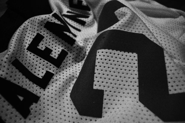
The infamous V jersey introduced by the Vancouver Canucks for the 1978-79 season is surely one of the more curious sports uniform looks in the history of sport. I happen to love it and tend to put it in the “so good it’s bad” category of design.
I get it: V is for Vancouver. But that gigantic V on the front of the jersey was just one of a total of nine V’s on that first-year design (they took them off the socks the next year, for a more restrained total of seven). Eventually they whittled it down to four on the next design that placed the skate crest on the front of the jersey. Ultimately, no V’s survived on the Canuck uniform, probably for the better; the hockey world is much more comfortable with perfectly horizontal lines.
And if all that wasn’t enough, the design was paired with a black, yellow and orange colour scheme that said nothing of Vancouver and much about what was happening in late ’70s design.
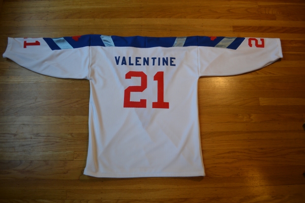
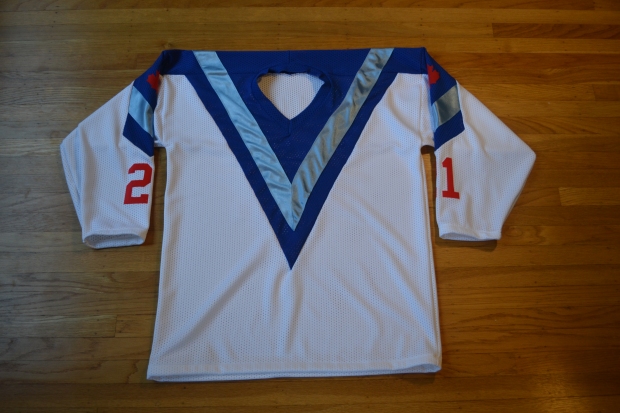
But what if this V design was paired with what may be the best uniform in Vancouver history: the 1979-84 Vancouver Whitecaps? The NASL franchise took a route somewhat similar to the original Canucks design from 1970: colours and a name that reflected the scenery and environment of Vancouver. Sky, water, trees, the natural beauty of the area. In the Whitecaps case, a clever double meaning of both the waves and snow-capped mountains.
So I made a jersey that paired the shocking V design with the beautiful colours of the Whitecaps. A hockey/soccer hybrid jersey. Two eras of Vancouver jersey history combined into one.
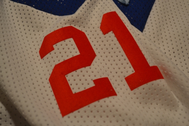
But V doesn’t just have to stand for Vancouver, in this case I made the jersey for Whitecaps great Carl Valentine. I think it’s a fitting tribute to a great player and great member of the community.
On this jersey, the V is for Valentine.